Concepts discussed on July 15, 2017
Data Interpretation - Unconventional Charts
Welcome to the live session of Data Interpretation - Unconventional Charts. The concepts and questions discussed on July 15, 2017 during the live session follow the embedded video. The video link next to each concept will take you to the start of the part of the video where that specific concept is discussed. Click the video embedded below to watch the entire session.
-
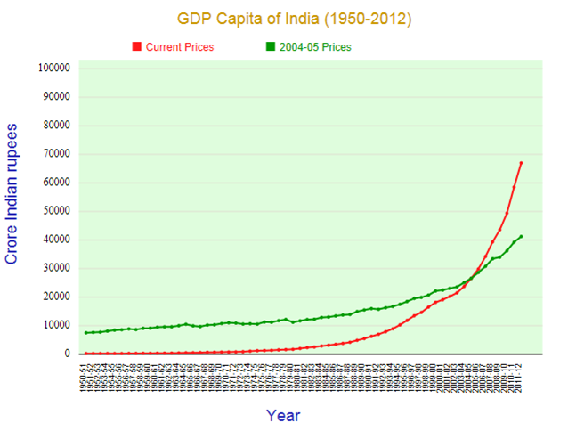
Is this chart good news or bad news?
-
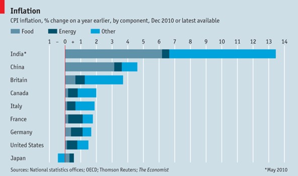
What does this tell us about birth rate and life expectancy?
-
What key input is required for this population shape to be “good news”. Conversely, what would make this chart “bad news”?
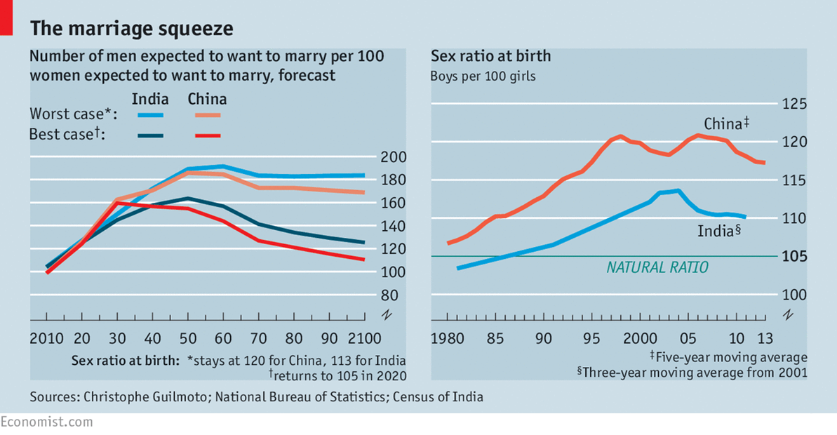
-
Why might China’s curve be like this? What might be the reason?
-
What might explain this?
-
What can you infer from the given chart?
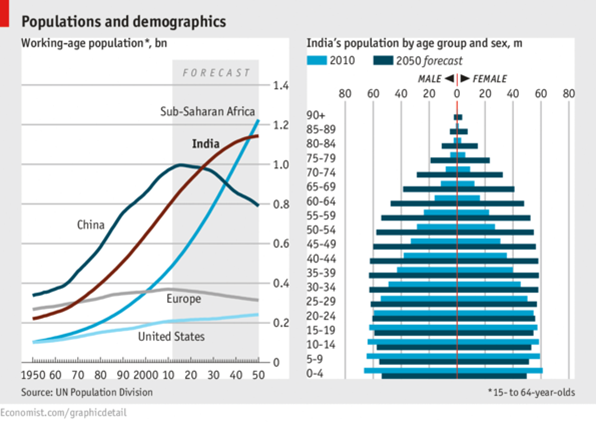
-
What might explain this?
-
What can you infer from the given chart?
-
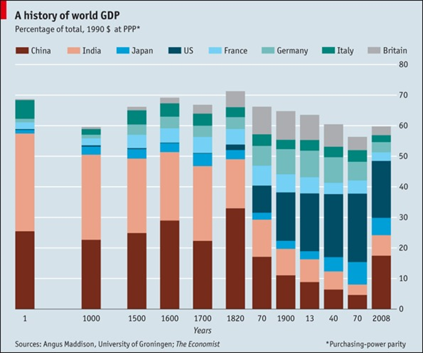
What would a nationalist interpret here?
-
What would a capitalism fan interpret here?
-
What is the key trend from 1970 to 2008?
-
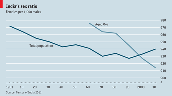
The 0-6 curve – what does it tell about how the “Total Population” will look like later on?
-
If the 0-6 age curve stays at the 915 level, what could that mean?
-
If the 0-6 age curve stays at the 915 level, what would it do the marriage market 20 years from now?
-
If the 0-6 number stays at 915, but the total population curve inches up, what might that be due to?
-
What can you interpret from this chart?
Unconventional Chart 1
Observe the charts given below and answer the following questions:
Parallel Track 1
Party X got a vote share of 32% in the last election and won 28 out of 60 seats, they won only 30% of the votes this election but won 36 out of 60 seats. What might explain this?
Unconventional Chart 2
Observe the chart given below carefully and answer the following question.
Parallel Track 2
Scottish National Party (SNP) and UKIP both won around 10% of the votes in the last election in the UK. SNP won more than 50 seats, UKIP won only 1. What might explain this?
Unconventional Chart 3
Observe the chart given below carefully and answer the following question.
Unconventional Chart 4
Observe the charts given below and answer the following questions:
Unconventional Chart 5
Observe the charts given below and answer the following questions:
Unconventional Chart 6
Observe the charts given below and answer the following questions: